The Sound Garden Project is a classical music program developed through Interlochen Public Radio, a broadcast service of Interlochen Center for the Arts. The Sound Garden Project's mission is to bring live classical music directly into your world. Matt Schlomer, founder and creative director of The Sound Garden Project, believes there is a an ever-widening chasm between people and classical music. Are there unique ways to experience live classical music outside of a concert hall? The Sound Garden Project introduces people to classical music in unique and intimate ways: at the gas station, playground, beach, a restaurant—you name it.
After interviewing Matt, a few words and phrases really stood out to describe The Sound Garden Project emotionally: unexpected, relational, curious, creative, inspiring, and "puts a smile on your face". The overall experience of The Sound Garden Project is approachable, fun, and unique. And while the experience is certainly unexpected and experimental, the listener is put at ease.
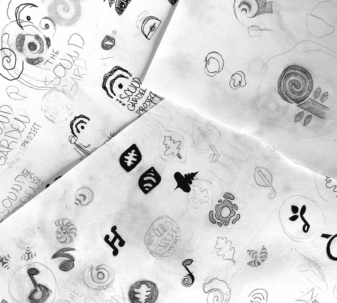
Sketches, sketches, sketches!
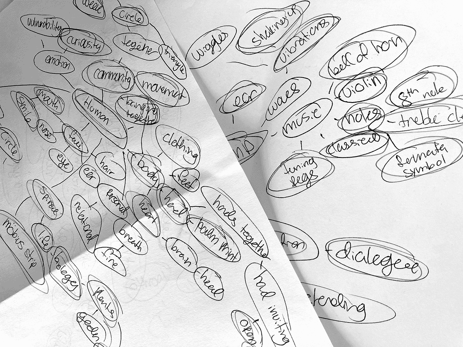
Thought bubble exercise of key words and potential imagery
After reviewing a mood board with Matt and conducting some routine thought bubble exercises, numerous sketches were done to brainstorm the visual identity of The Sound Garden Project. A few key things were important: we wanted to include imagery from the name and their tagline, "planting classical music in unexpected places", without appearing garden related, the logo needed to be playful, exciting, and fun but not childish, it needed to portray sound or classical music but in an unexpected way, and it needed to have mass appeal as the audience was anyone and everyone.
Three distinct directions formed:

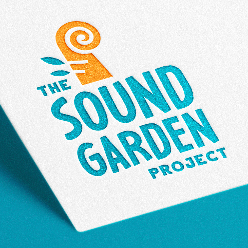
To the left is a music note in the shape of a seedling, the middle an abstracted scroll of a stringed instrument loosely shaped like a fiddlehead fern with leaves for tuning pages, and the right a leaf turning into sound waves or vise versa. Matt and the board were excited by all three options, and after some deliberation, the middle option was chosen to be further developed and refined.
We leaned more into the fiddlehead fern aspect by including a spiral while also trying to avoid an unintentional tribal aesthetic. The leaves were jostled to add some movement. The font used in the word mark was chosen for its fun, dynamic, and approachable characteristics.
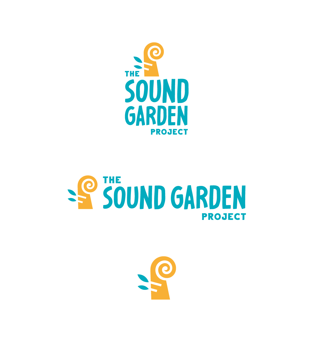
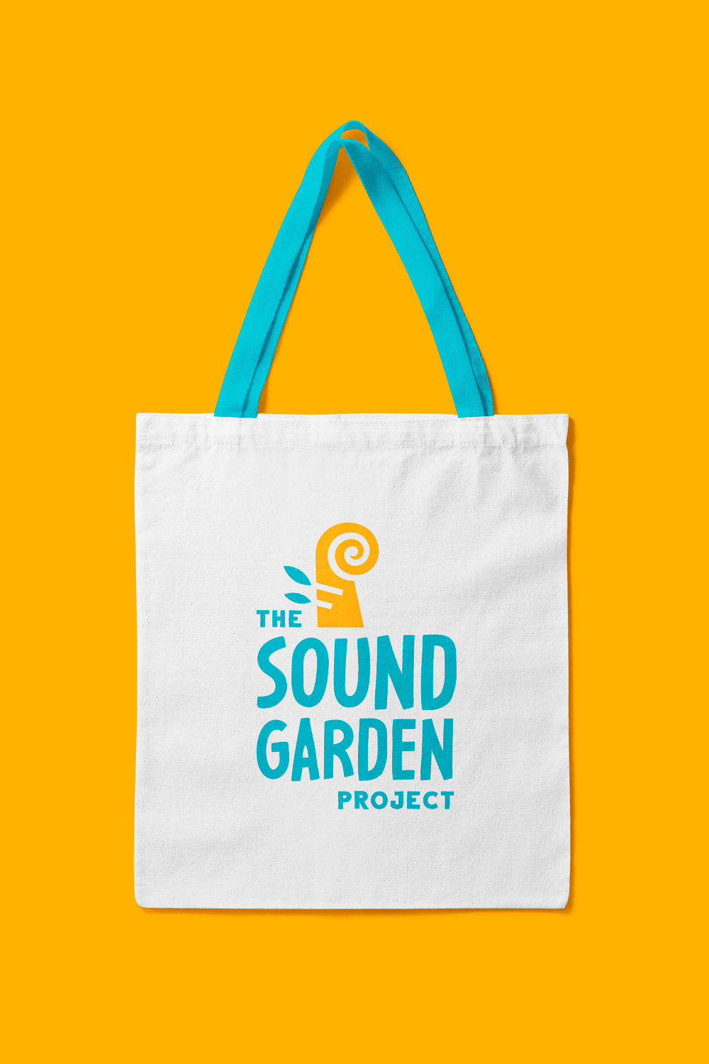
Turquoise is a vibrant color, and can symbolize communication and happiness. It is a union between two well liked colors (regardless of gender): blue and green, making it a good color for a brand meant to have mass appeal. Yellow is generally regarded as representing cheerfulness, optimism, and creativity, all characteristics of The Sound Garden Project.
It was a pleasure working with Interlochen Public Radio to develop a visual identity for The Sound Garden Project. Check them out this summer!