COPA Pilot is a member exclusive, monthly publication for the Cirrus Owners and Pilots Association (COPA) produced and printed by VP Demand Creation Services. COPA Pilot features many articles from professionals (trainers, engineers, etc.) and members that range from technical instructions to casual lifestyle tips.
COPA sought a redesign of their publication that reflected who they were in a few key words: safety, community, travel, lifestyle, educational, enthusiasm, Cirrus-focused, and informative. COPA's goal is for their publication to be the top source of Cirrus life, and to be on par with similar aviation club magazines. COPA felt their previous layout and design was bland and cluttered, and didn't represent the excitement and passion the community had for Cirrus.
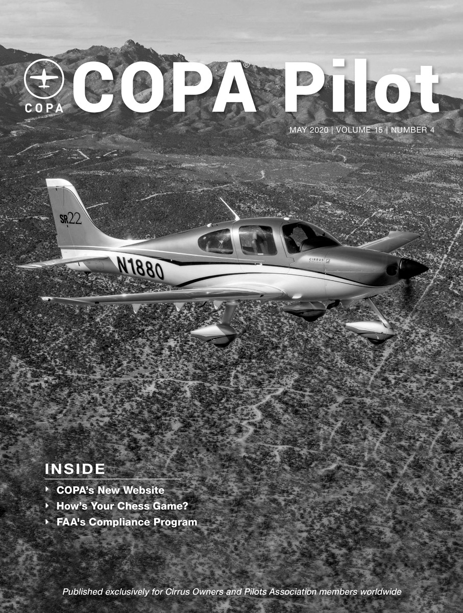
Old Cover

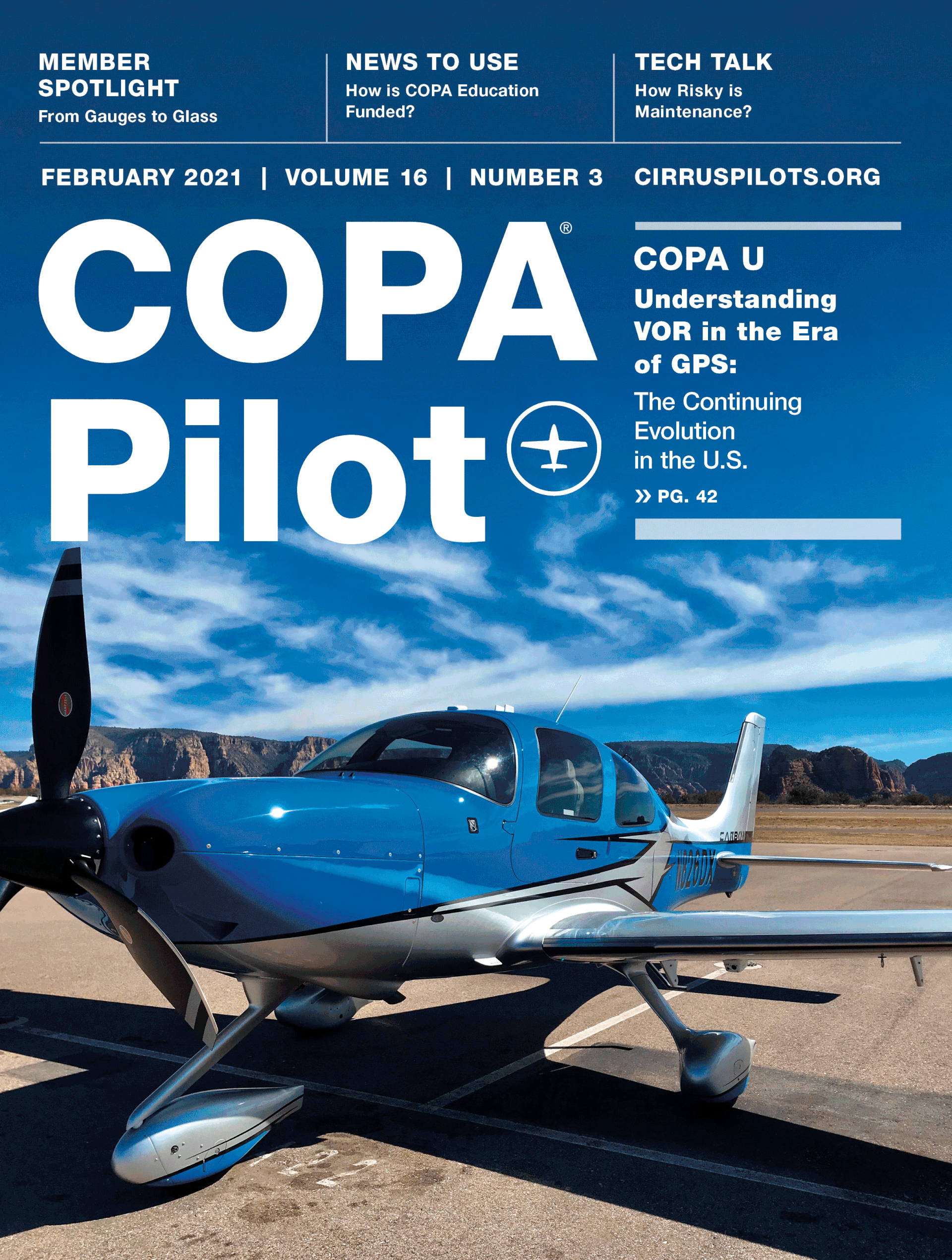
New Cover
Left: old cover, right: updated cover
COPA wanted one thing for the cover: for the reader to be excited when they held it. COPA Pilot features high quality expert content, so articles and "what's inside" are now featured front and center. The type is bolder and punchier, and the layout was modernized and updated to match the new interior layout. The cover became laminated to help the magazine standout from other aviation club magazines that members receive.
Prior to the redesign, COPA struggled with making their editorial content shine. While they felt their articles were exciting, the magazine layout didn't reflect this. They felt their magazine lacked individuality, and the layout was bland and cluttered. Another issue COPA mentioned was navigation; there weren't clear beginnings and ends between articles, and ads would often chop up text in confusing ways. Readers had a difficult time finding where they were in a story.
Below are examples from the old layout of COPA Pilot.
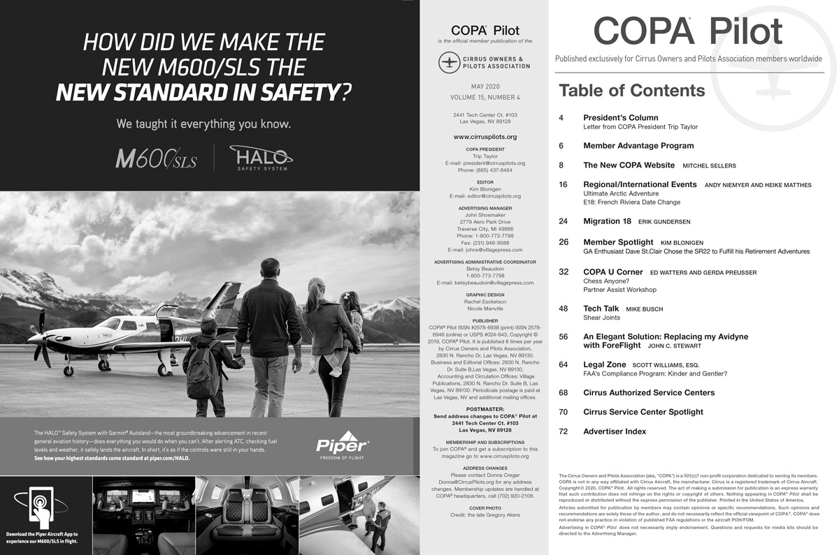
Old table of contents
Old president's column
Old starting spread
Old article spread
Above: old layout of COPA Pilot.
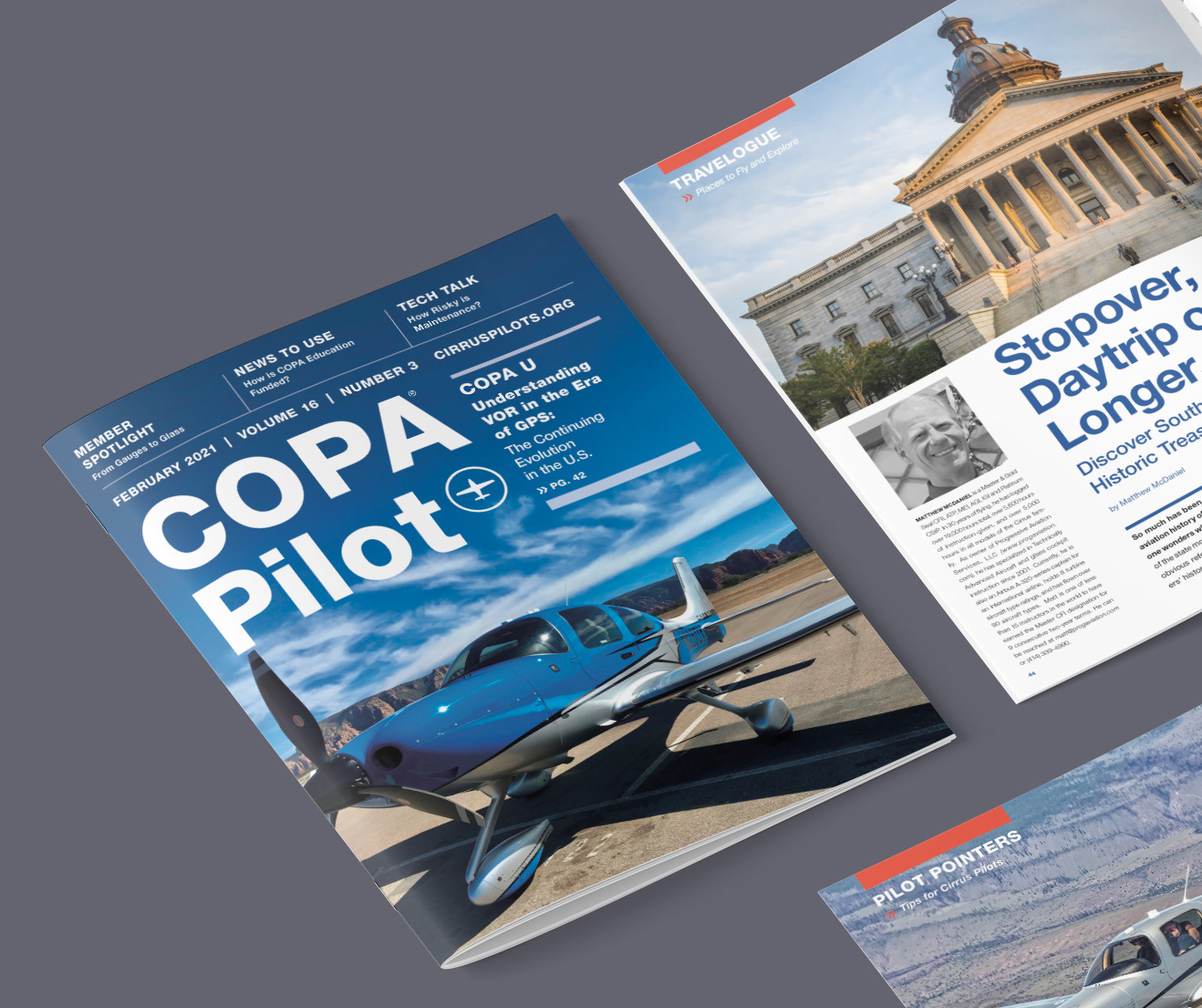
To solve these issues, the layout was rebuilt from scratch. Their signature blue was updated to a more vibrant, contemporary hue. A contrasting red was included to direct the reader's eye and add excitement. Navigation was one of the founding principles of the redesign, and tabs at the top left and right of the spread worked as guides for the reader. Author photos, clear titling, and a line graphic over the first column were added to make the start and end of articles more obvious. As COPA is very community oriented, the author photos also served to help readers recognize experts and instructors they've met in classes or get-togethers. Ads were no longer put on starting spreads, and guidelines for ads were put in place to prevent articles from appearing chopped up.
COPA's target audience is Cirrus pilots from around the world, so a Swiss international design style was utilized. The design also is inspired by something every Cirrus pilot has seen and thus can relate to: Cirrus instruction and maintenance manuals.
Below are examples from the updated layout of COPA Pilot.
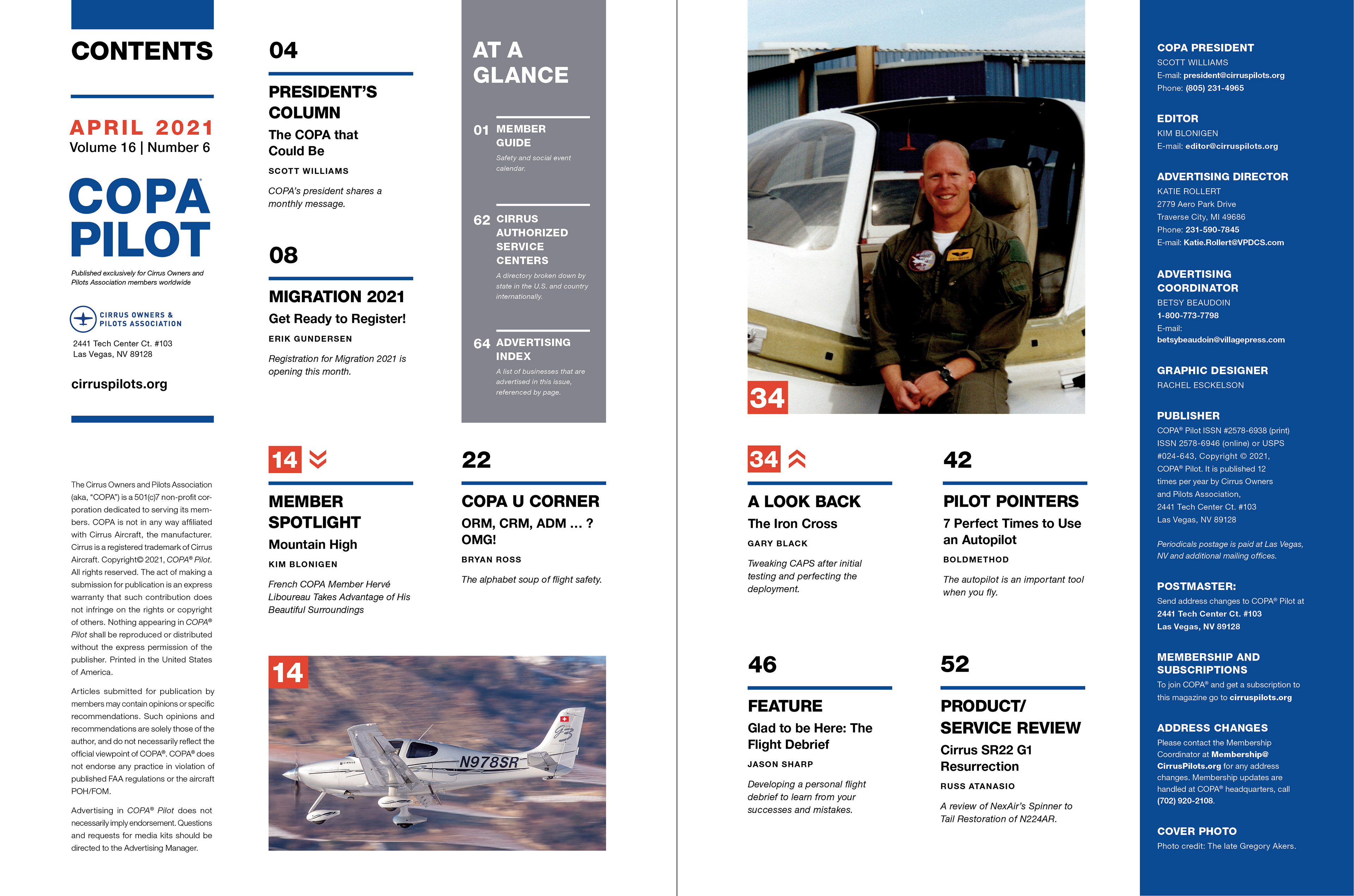
Above: The TOC was updated to two pages to make room for article descriptions and preview images to help excite the reader and add some personality. Departments, article titles, authors, and page numbers are clearly labeled to help with navigation.
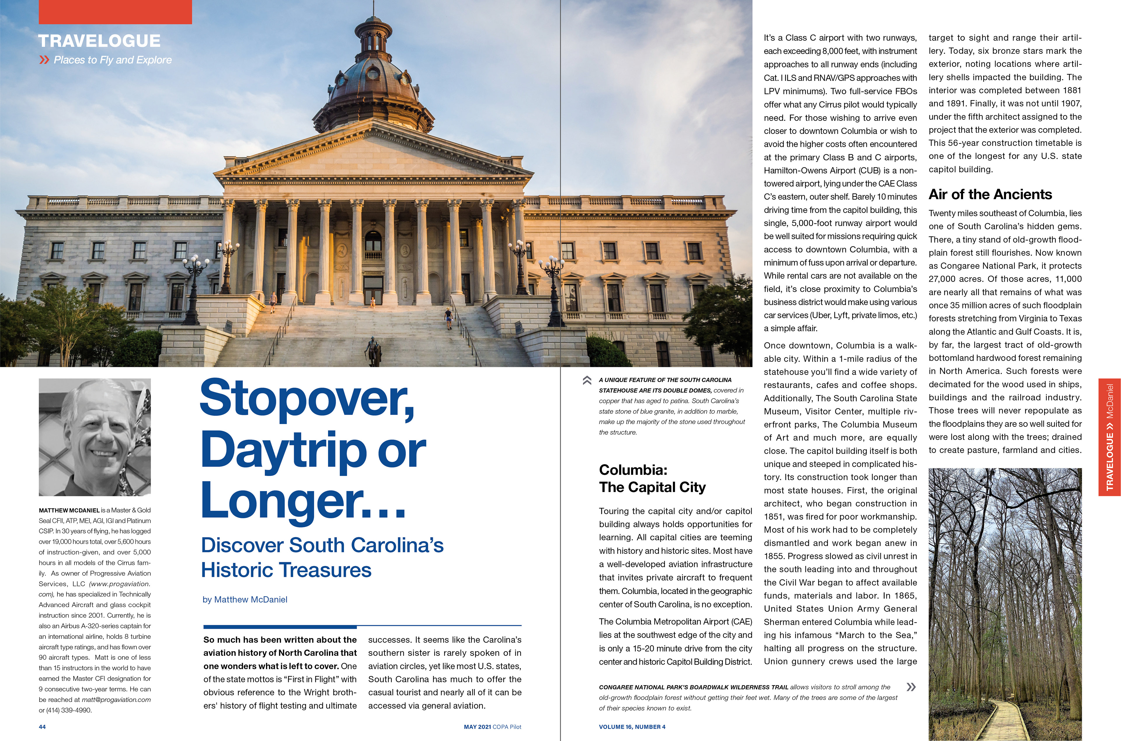
Above: Clear titling, author photos, and the line graphic over the starting spread help readers identify the start of an article. Tabs at the top left and right inform the reader of where they are in the issue.
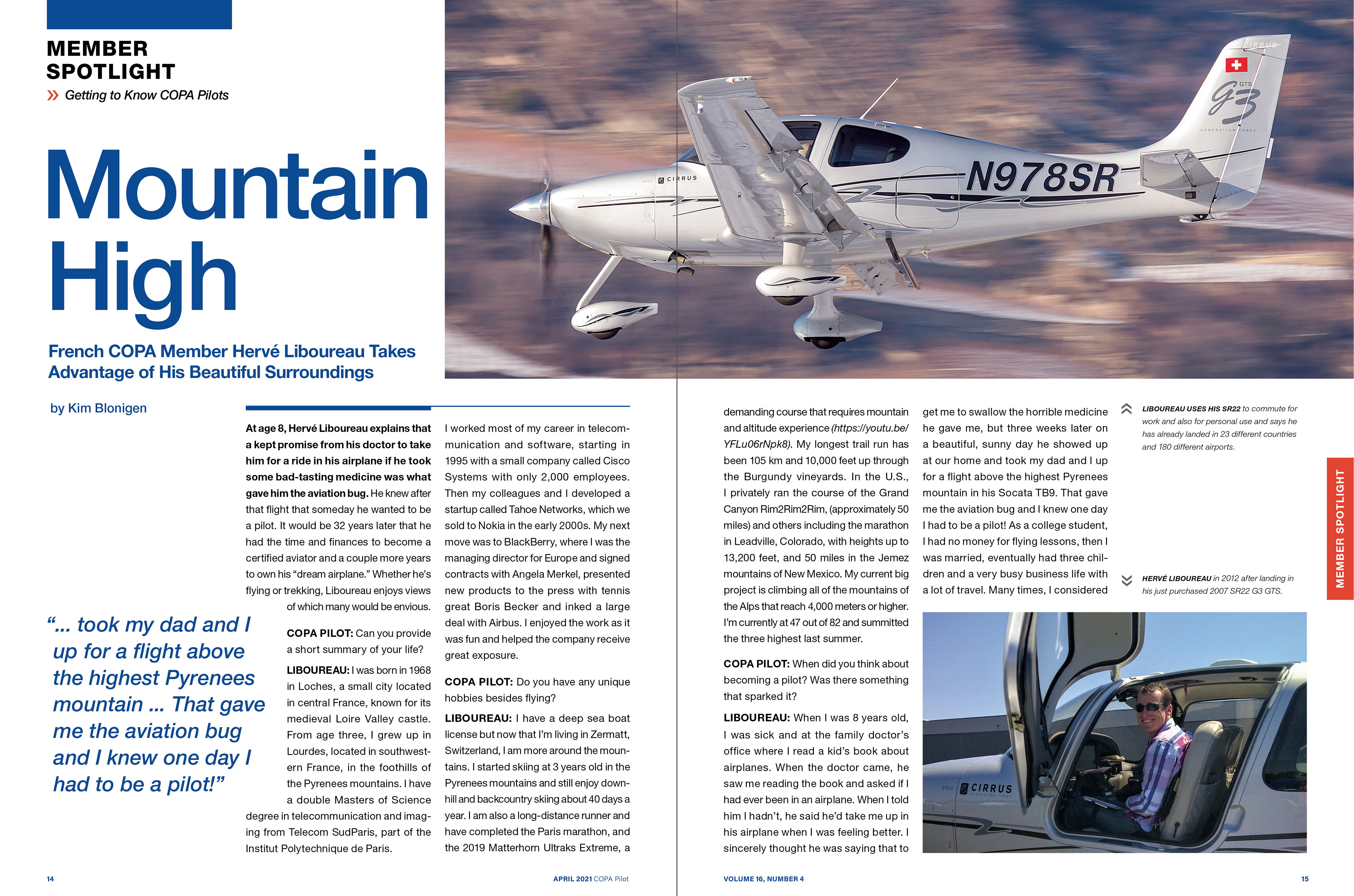
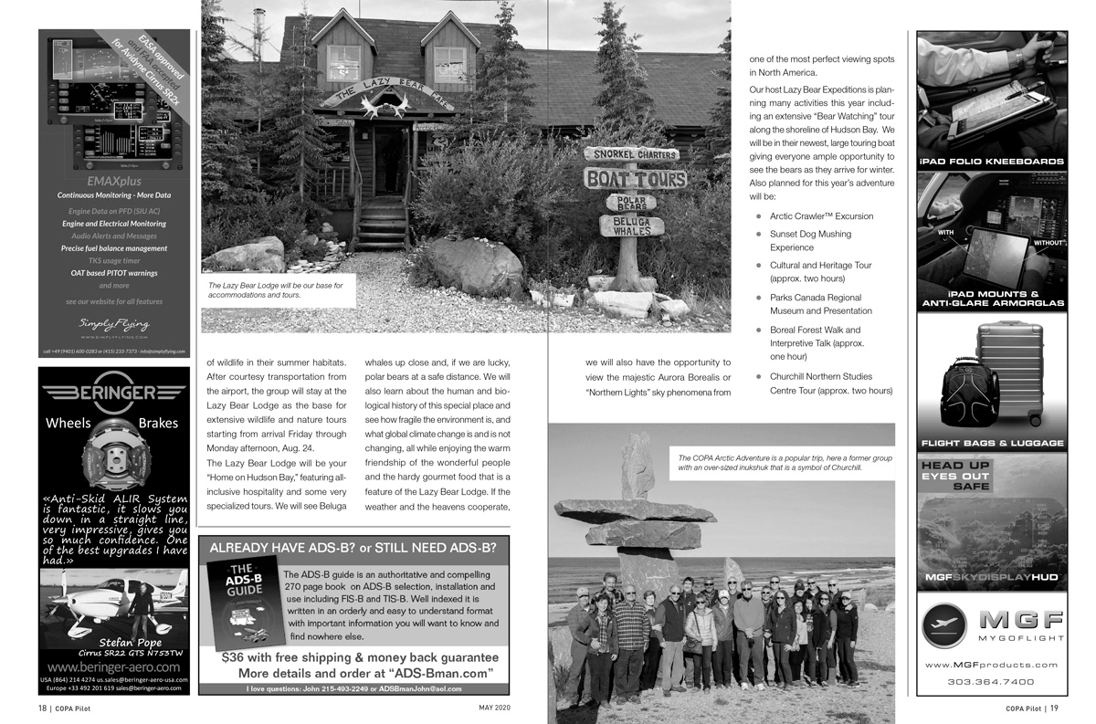
Above: A modular grid was adopted to allow for more dynamic, as well as consistent, photo placement.
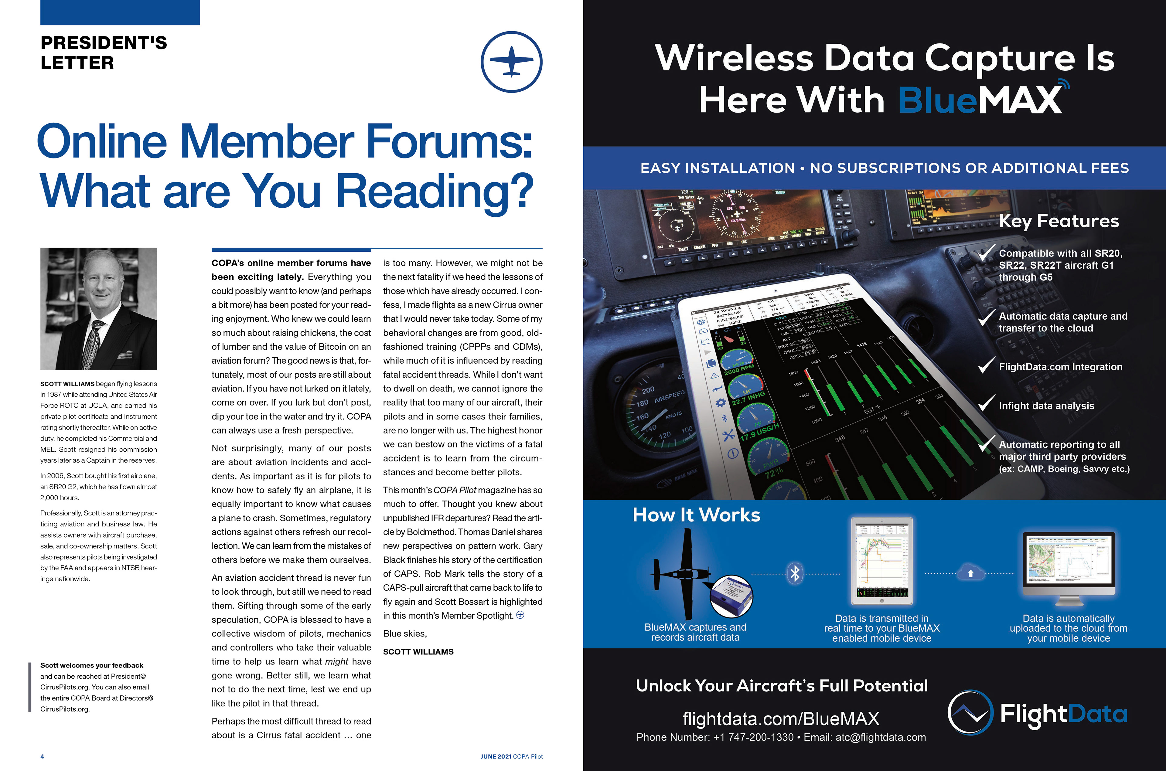
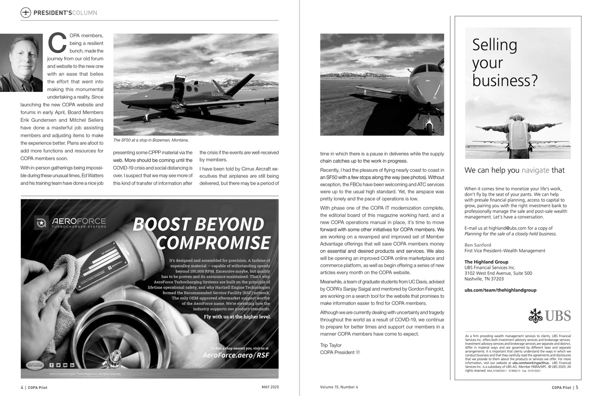
Above: Updated President's Letter.